Pages

Wednesday, February 25, 2015

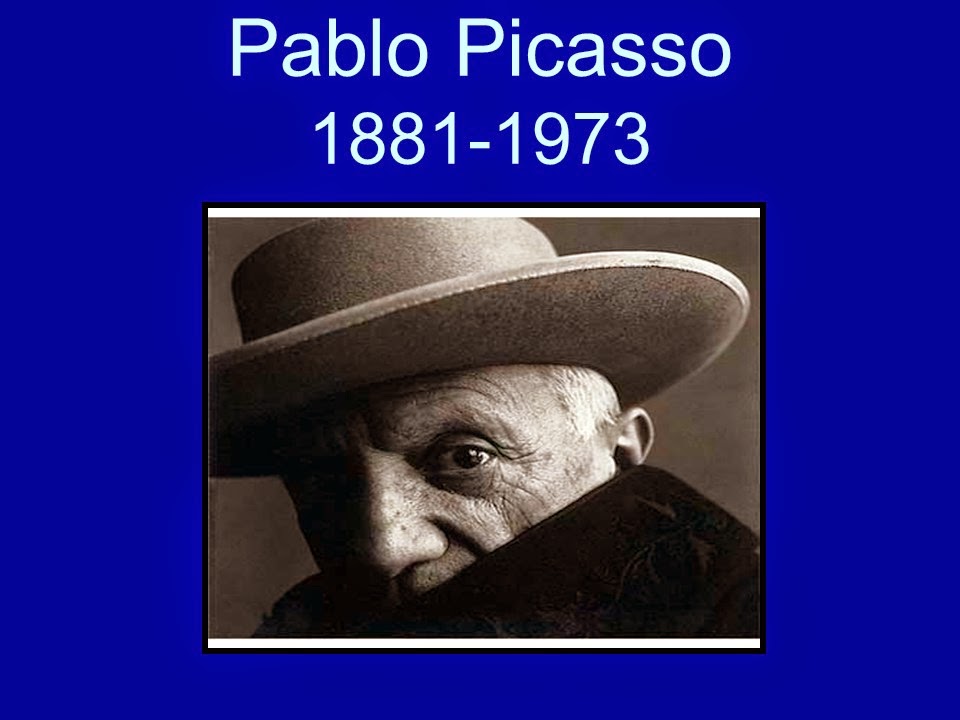
Pablo Picasso


Pablo Picasso was probably the single most influential painter of the twentieth century. Often challenging established artistic ideas, his work has provided inspiration to many modem artists. Although his style varied throughout his long career, Picasso's vision was always original.

The son of an art teacher, Picasso was born in Malaga, Spain. He moved to France in 1904 to join the exciting art community that was forming in Paris. Although he retained a strong feeling for his homeland, he lived in France for the rest of his life.
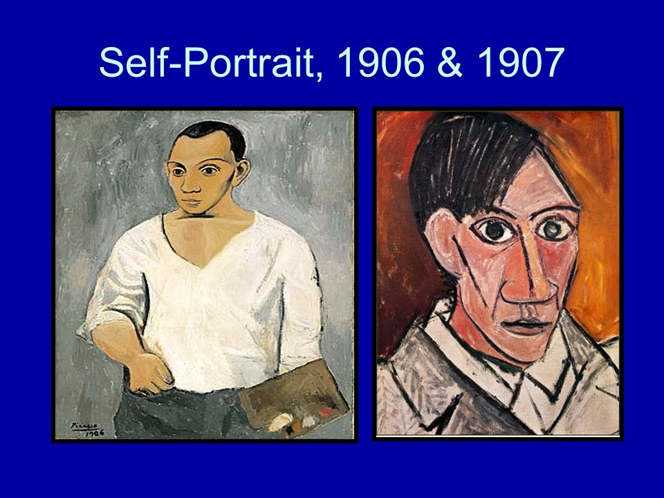


His early career can be divided into two sections, the Blue Period and the Rose Period. In the first, he painted thin, discouraged-looking people in poor surroundings and used shades of blue, green, and gray to express their despair.
The second period was marked by the use of warmer colors to portray happier subjects, such as clowns and acrobats.
However, Picasso soon abandoned realistic portrayals altogether.

A 1907 painting, Les Demoiselles d'Avignon, was landmark artwork that broke with traditional art in every way.
 
The figures in this painting are distorted, fragmented, and barely recognizable as human.

This work was one of the first in an entirely new art style, later called Cubism. Picasso, with his friend George Braque, founded the Cubist movement. In this style, no attempt is made to recreate an illusion of reality. The artist aims instead to explore the geometric forms, lines, and planes of the subject.

Later, Picasso and other Cubists began to add actual objects to their paintings, inventing collage.
In the 1920's and 1930's, Picasso moved through still more changes in style.
 
Some paintings of this period show figures that seem to be changing before our eyes and images that call up subconscious ideas and feelings.


His greatest work of this period is Guernica, 1937, a painting reflecting his deeply felt anguish at the bombing of a town in his native Spain.
 
In this painting, Picasso employed distortion and symbolism to express terror and despair.

From the 1940's onward, Picasso continued to explore the themes and techniques he had established.
 
 His work now included not only paintings but sculpture, ceramics, graphics, and drawings. He continued to work until his death at ninety-two, leaving behind a vast array of styles, themes, and works.

Below are the instructions for the project.
 
Try to use these words for the project

Abstract~ Create art that is not a realistic image but an imaginative, creative, expressive way to show the essence of something.

Kid's word~ weird, twisted, crazy, strange, fragmented, distorted.

 
Asymmetry~ Not symmetrical, not the same on each side. Kid's words- lop-sided

Cubism~ A style of painting/drawing where you divide your portrait or object into geometrical shapes.


1 Hand out one piece of drawing paper and one piece of black paper. Have the students write their name and class name on the BLACK piece of paper. The white paper will be for the drawing and then it will be cut into pieces and glued onto the black paper.

 
2 Draw an oval or circle for the head. Make it LARGE. The portrait should take up most of the paper

 
3 Draw a light line down the center of the oval. This is a guideline for placing facial features.

 
4 Draw a light line across the center of the oval. Also a guideline.

 
5 Add eyes, nose, mouth, ears, hair, etc.           

 
6 Outline each facial feature with black marker. Make some lines THICK and some THIN.

 
7 Color the drawing with colored pencils. Use Bold and bright colors. Use Dark and light colors.

 
8 Cut out the head/portrait. Cut the drawing up. Make use of Cubism's
geometrical shapes: triangles, squares, rectangles

Larger pieces may work better.  For Kinder-1st maybe only 4-5 pieces.

 
9 Rearrange the pieces to create a "Picasso" style face.

*Leave space between most of the pieces

*Put at least two of the pieces UPSIDE down

*Overlap a few pieces.

 
10 Leave space at the bottom and put on a "Picasso" label. You may want students to put the label on before gluing the pieces to ensure room for the label .

 
11 Glue the pieces down onto the black paper.


Monday, December 8, 2014

  • CALENDAR AT BOTTOM OF POST
  •  
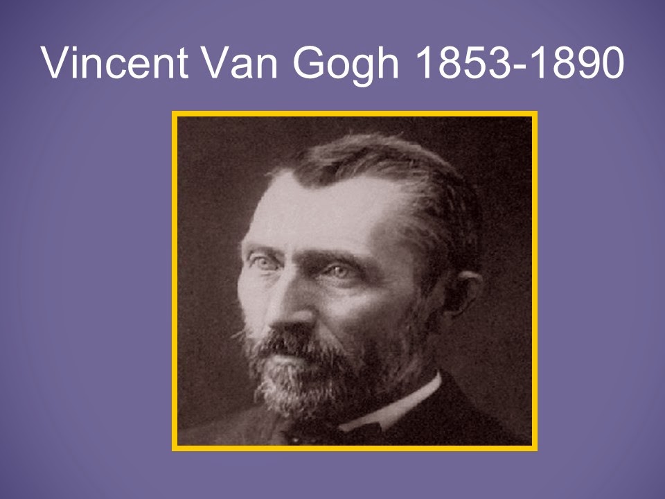
Vincent Van Gogh
 
At l6 Van Gogh started selling art in England.
Van Gogh decided to be a missionary in Belgium when he was in his 20's.
The poverty he saw made him so sad, that he started painting what he saw.


The Potato Eaters, 1885

How does this painting make you feel?
He painted in dark colors to portray the sadness.
This was before Van Gogh had any formal training.
At this point, Van Gogh didn't realize the importance of color.
 
Boots with Laces. 1886
 
Van Gogh started painting traditional Dutch subjects.
They are landscapes, portraits and still life, like the shoes.
 

Self-Portrait with Pipe. 1886

Van Gogh concentrated on the subject's eyes and expression when doing portraits.
Around this time, Van Gogh moved to Paris, France to live with his brother.
Van Gogh met impressionist painters.
Notice the difference between the first painting and the one to the right of it.

Self-Portrait in Straw Hat, 1887

How is this portrait different from the one on the left? (brighter colors, freer strokes,
happier feeling)


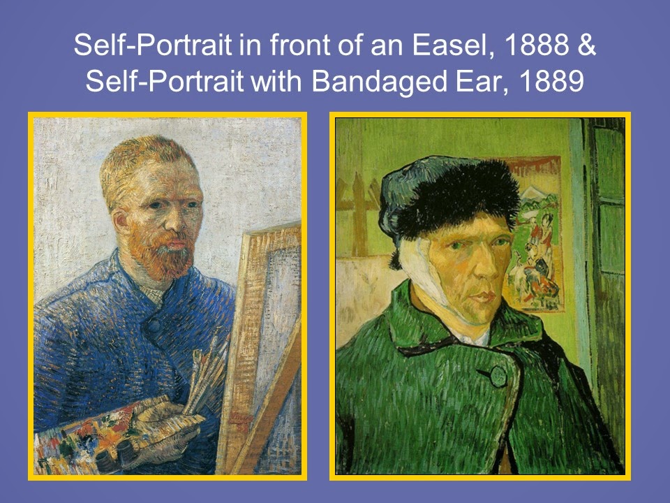
Self-Portrait in front of an Easel. 1888

Van Gogh moved to the south of France where the weather was nice and continued
painting impressionist style.

Self-Portrait with Bandased Ear. 1889

Van Gogh suffered mental illness (depression) for many years.
This painting was done after Van Gogh cut his ear lobe off to send to a girl he liked.
He painted the picture to use as a photo to send to his brother, Theo, showing that he was
okay.
 

Gauguin's Chair. 1888

Gauguin was an artist friend who lived with Van Gogh for a while.
He painted this as a tribute to his friend.

Vincent's Chair with Pipe. 1888

Van Gogh liked to paint in yellows and blues mostly after meeting the impressionist
artists.  

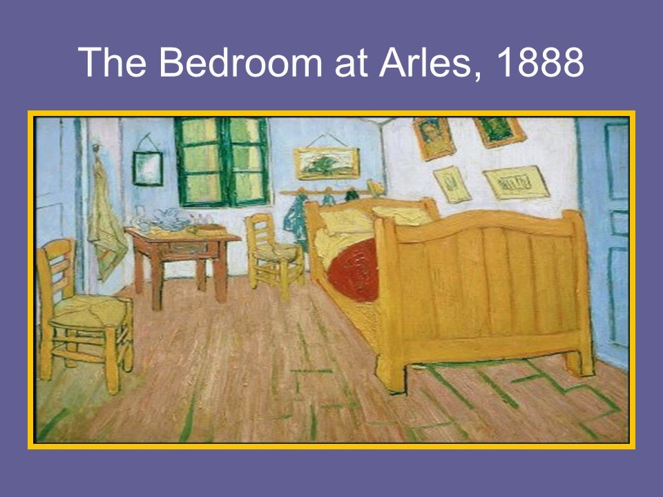
The Bedroom at Arles. 1888

Van Gogh would paint pictures to show where he lived.
He used paintings like we would use photographs today.


Vase with 12 Sunflowers. 1888

Van Gogh did several still life paintings of sunflowers.
He used thick brushstrokes (impasto) and heavy layers of paint.

Sunflowers in a Vase, 1888

Van Gogh created some of the sunflower paintings with the intent of decorating the
bedroom walls in Arles where his friend Gaughin was to stay.


Café Terrace/Sidewalk Café at Night. 1888

Vincent thought night was more richly colored than day, so he liked to paint night scenes.


Road with Cypresses, 1889

Van Gogh's studies of Cypresses lead to his painting of Starry Night.
Characterized by swirls and movement
He combined impressionism with feeling creating Expressionism.
This is created at a time when Van Gogh was depressed and feeling sad.
Starry Night. 1889

This is one of Van Gogh's most famous and emotionally powerful paintings.
Sometimes when Van Gogh painted, he would just squirt the paint right on the canvas
instead of using a palette - a very thick application.
Van Gogh was fascinated with astronomy and the sky. He liked to paint haloed stars,
moons and suns.
 

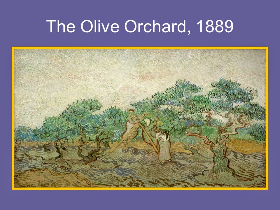
The Olive Orchard. 1889
 
This is considered by Vincent to be muted colors. (less bright and more conservative)


Crows Over the Wheat Field. 1890

Van Gogh painted from the landscape he saw of Arles.
This is one of his last paintings.
Can you sense the wildness and turmoil he felt by looking at some of his paintings?
He wrote to his brother Theo when the weather in Arles had worsened how there were
"vast fields of wheat under troubled skies", adding that he did not "need to go out of my
way to try and express sadness and extreme loneliness".
Van Gogh died in 1890 when he was 37 years old.
He sold only one painting during his poor and difficult life.


Friday, October 3, 2014

Maurice Sendak, Illustrator 1928-2012

 
MAURICE SENDAK
Illustrator 1928 - 2012
 Calendar at bottom of Post
 
 
 Photographs of Maurice
 
Sendak was born in 1928 in Brooklyn, New York, Sendak is an American writer and illustrator of children's literature. He is best known for his book Where the Wild Things Are, published in 1963 and recipient of the Caldecott Medal. Sendak was a frail and sickly child so he spent much of his young life indoors; he developed a love for books. It was during this period that he began to draw and allow his imagination to run free. He was age 12 when he decided to become an illustrator after viewing Walt Disney's film "Fantasia".  Above, the 1984 photograph on the right shows Sendak at work.

 
Self-Portrait for TV Guide, 1978.
 
 Walt Disney's Mickey Mouse was a dominant figure during Sendak's childhood. He looked on the mouse hero as "an early best friend" and recalls his earliest color drawing of the mouse when he was only six years old.
 
 
  Toes are to dance on and A book is to look at. pen and ink from "A Hole is to Dig" by Ruth Krauss. 1952
 
 This pen and ink drawing was one of several he did to illustrate a book called "A Hole is to Dig" It was his first major assignment as an illustrator. The book has no plot, but is a collection of genuine children's definitions. Some of them are: "Dogs are to kiss people", "Hands are to wash", and "A hole is to dig". Sendak collaborated closely with the author on his illustrations. She agreed to share the books royalties with the young artist. He is an artist who varies his style from project to project. Here, the simple clear line drawings add a fresh and easy charm to the simplicity of the text. Do you enjoy reading and looking at books? Where is your favorite place to read?

 
"The Sign on Rosie's Door''. 1958
 
This is his third book and finds a more self-assured artist where in the story he casts Rosie in a slice of Brooklyn life drama. Rosie carries her less imaginative cronies aloft on flights of fancy. Thanks to Rosie, they are able to defeat the boredom of a long summer day by attending a command performance by "Alinda the lovely Lady Singer". He looks fondly on this work as a major advance in his lifelong exploration of the ways in which children turn to fantasy as a means of escaping their daily troubles - in this case, endless stretches of vacation time with "nothing to do".

 
 The Riverbank. watercolor. from "Mr. Rabbit and the Lovely Present" by Charlotte Zolotow,1962

This is one of the most popular works of Sendak's early years. The story is about a little girl who is looking for a present for her mother and accepts help from a rabbit she meets. The illustrations for this book were all done in soft luminous watercolors.
Sendak had seen an exhibition of watercolors by Winslow Homer in Massachusetts which inspired him to try the same style and technique here. As Homer worked in New England, he also chose a setting in Vermont to paint his illustrations.

 
  "Where the Wild Things Are". pen and ink with watercolor by Sendak. 1963
 
 This is his most popular children's book. We are looking at the cover page from the book. The illustrations were done in pen and ink and colored in with watercolor. The story is about a boy. Max, who dresses up in a wolf suit and makes "mischief of one kind or another." When he misbehaves, he is sent to bed without supper and then travels to the world of the Wild Things where he becomes king. The text is very simple, a loose free verse, but the monsters whom Max meets are a wonderfully complex mixture of frightening and funny. Some of you may have seen the movie based on these characters.

 
MAX

Max from "Where the Wild Things Are"~ Notice all of the pen and ink lines. Does Max look happy to you? Max is banished to his room with nothing to eat. Have you ever been sent to your room?
 
 
Wild Rumpus

  Wild Rumpus from "Where the Wild Things Are"~ Here, Max has tamed the Wild Things by staring into their yellow eyes. They have made him king and are having what Max calls a "wild rumpus". Once again we can see Sendak's wonderful technique of crosshatching his characters and his colorful watercolor backgrounds. When this book was first published, there was some concern among adults that the monsters would be too scary for young children. Children, however, clearly love the book. Awarded the Caldecott Medal for the most distinguished picture book of the year in 1963, it consistently sold over 30,000 copies since its publication.

 
  "In the Night Kitchen", pen and ink with watercolor. 1970
 
To the left we see the cover of the book, and to the right we see one of the detailed pages showing the bakers. Can you see what the bakers are doing? Does something seem peculiar to you? Here the bakers absentmindedly mix Mickey into their batter. When Sendak was young, there was a bread advertisement for the Sunshine bakers, and it read "We Bake While you Sleep!" He used to save coupons showing three fat little bakers going off to their magic place while he went off to bed. This book was sort of a vendetta, he confessed, "to get back at them and to let them know that I was now 'old enough to stay up at night and know what was happening in the Night Kitchen."
Notice on the cover the various shapes of the bottles. Do they appear to represent something - perhaps a city of buildings? In this book he made good use of some verses he had chosen for an abandoned Mother Goose project. His hero. Mickey, announces "I'm in the milk and the milks in me" is a variation of the rhyme "I see the moon. and the moon sees me."

 
 Mickey from "In the Night Kitchen". pen and ink with watercolor, 1970
 
 A small boy,Mickey, is awakened by a racket in the night and falls through the dark, out of his pajamas. He falls past his sleeping parent's bedroom, and into a bowl of dough.  In to the night kitchen, as we noticed from the previous slide.


We will be doing Scratch art "monsters"
 
Schedule Sendak Presentations with your teachers for October or November.


Sendak Scratch Art Monsters


For Kinder through 2nd grade:

1.  Practice texture techniques with pencil on the handout.

2.  Choose a couple of texture techniques to practice on the small scratch art square piece with scratch tool.

3.  Choose a scratch art paper with a monster already outlined. (2 designs to choose from)  Have them immediately put their names on the back!!!

4.  Start scratching away the black layer along the outlines and fill in desired details around the face, adding textures. (You can show them the outlines with the facial details etc. on the larger paper example found in the notes folder for reference.)


For 3rd through 5th grade:

1.  Practice texture techniques with pencil on the handout.

2.  On a blank piece of paper draw a monster.  (Use the colored half sheets)  Once you are finished with your outline and simple details, make sure that it is outlined with heavy dark pencil.  (May need to have them trace over it again to make it darker.)

3.  Put name on the back of the scratch art piece!!!  Turn your monster sketch over on top of the black side of the scratch art paper and tape it in place or hold it carefully.  Rub with the side of your pencil lead and cover the paper.  (You will see a light impression of your drawing coming out, and this will be rubbing your drawing onto the scratch art paper.  Please note that the image will be reversed- mention this to the kids ahead of time.) Remove the colored paper.

4.  Choose a couple of texture techniques to practice on the small scratch art square piece with scratch tool before tackling the big project.

5.  Begin working on your monster piece- start scratching away the black layer along the outlines of your drawing, and fill in texture areas.  


***Please note: if a student is struggling, you may want to provide a pre-outlined monster stencil to use and roughly follow steps for kinder through 2nd grade with them.  These are in the folders on the cart.  (You can show them the outlines with the facial details etc. on the larger paper example found in the notes folder for reference.)

*Items on the cart:  Notes, scratch tools, glue, and Sendak books. (Cart is by the sink in the art lit space in the library.)

*Items to pick up from the shelf (Bottom right shelf in the art lit space of the library):  1 Scratch art piece for each student (Take both designs), 1 small practice square scratch art piece for each student, 1 texture handout for each student, labels for each student, and 1 white construction paper backing for each student. 

Don’t spend too much time on the prep parts, encourage them to move along…they will need extra time for the work on the actual scratch art part.
EACH STUDENT GETS ONLY ONE PIECE OF SCRATCH ART PAPER!!!!  
For 3rd through 5th grade (continued):

Art Lit Presenter: Please back the pieces on the white paper.  (Label and write first names on them.  See example picture below.)  Return them to the art lit space and file them on the desk with a file folder.  Reassure the students that they will get them back, we just need to store them for a bit in case we decide to do an art show to display their work.


Have fun!! Looking forward to seeing some finished art work!!