Pages

Wednesday, November 8, 2017

Eric Carle


Eric Carle
(Calendar at bottom of post)


• Born in Syracuse, New York, in 1929, Eric Carle moved with his parents back to their native Germany when he was six years old.
 • Eric Carle has illustrated more than seventy books, many best sellers, most of which he also
wrote, and more than 132 million copies of his books have sold around the world.
 • The themes of his stories are usually drawn from his extensive knowledge and love of nature—
an interest shared by most small children.
• Eric Carle has two grown-up children, a son and a daughter. He divides his time between the
Florida Keys and the hills of North Carolina.

(Use the BIO sheet for more information. At bottom of post) 


Brown Bear, Brown Bear, What Do You See? 1967, written by Bill Martin, Jr.

This is Carle's first illustration for a children's book. After seeing one of Carle's creations of a red
lobster for an advertisement, author Bill Martin, Jr. requested Carle illustrate this book. Carle gladly
accepted as he wanted children to know the joy that can be found in books. Here he used
commercial tissue papers which could be found in forty shades.


 1,2,3, to the Zoo, 1968

Carle submitted this wordless book to editor, Ann Beneduce, for publishing and was pleasantly
surprised to receive a contract. This launched the beginning of Carle's career as an illustrator of children's picture books as well as a long working relationship with his editor. After discovering that commercial tissues fade in the sun, Carle began to personalize plain white archival tissue papers with rich colors and texture.


 The Very Hungry Caterpillar, 1969

Inspired by his first book contract, Carle submits a story about a green worm to his editor. She
suggests that he use a caterpillar which might be a more appealing insect. After bouncing ideas back
and forth with Ann, Carle exclaims "butterfly!" and this classic story is born. With over 41 million
copies sold since 1969 this book has been translated into more than sixty-two languages.


 Pancakes, Pancakes!, 1970; re-illustrated 1990

Jack wants some pancakes, but first he must gather eggs from the chickens, wheat from the farmer,
flour from the miller, milk from the cow, etc. His mother shows him how to cook and flip them, and
hungry Jack knows what to do with them next.


The Tiny Seed, 1970; re-illustrated 1987

Here Carle's collage pictures dramatize the life cycle of all plants, as one tiny seed grows into an
enormous sunflower, which then produces more seeds in its turn. Can anyone tell me what color you
get from mixing red and yellow? What colors do you think Carle used to create the flower? That's the
beauty of his work. It can be duplicated by children!

Eric Carle Bio

Vocabulary words: Collage, Texture, Contrast

Eric Carle is an American illustrator and author. He is famous for writing and illustrating children’s books, many about animals. He was born in 1929, and when he was little, his family moved to Germany. He moved back to the US when he was grown up, and he has a son, and a daughter.
Eric Carle’s first book was published when he was 38 years old. He loves animals, and most of his books are about animals. Some of his most famous books are The Very Hungry Caterpillar, 1 2 3 to the Zoo, and Brown Bear Brown Bear What do You See? . He started the first museum in the United States that is filled with nothing but art from children’s picture books. Eric Carle makes most of his illustrations with collage. Collage is when the artist tears or cuts paper into pieces and glues it down to make a picture. This is a self portrait Eric made of himself using collage.


 He paints plain tissue paper, then cuts or tears it into pieces, then glues the pieces down to make pictures of animals and other things.
The way he paints the papers gives them lots of texture. Texture is what something feels like - is it smooth or rough, is it soft or hard? An artist can draw or paint textures on a picture to show fur, or feathers, or scales, or whatever he wants.
Look at his picture of a bear.
Can you see all the texture on the animals? The squiggles and the stripes? Would the picture look different if the artist had just used a solid color? What did he do to make the background look more interesting?
Eric Carle makes his animals and bugs stand out from the page by using lots of contrast. Contrast is when things look very different from each other, so you can see them very easily. Eric Carle does that by making the animal and the background different colors. His books often use a white background, like he does in this picture of a cat.
See how the cat stands out from the white background?
Sometimes Eric Carle uses color in the background, like he does in this picture of the Grouchy Ladybug.
Can you see how he made the colors of the leaves different from the colors of the ladybug so she would show up?
For our project today, we will try to use texture and contrast to make our collage pictures stand out and look more interesting.


Templeton Elementary School Art Literacy Program
Eric Carle Project

Getting ready

Presenters, first thing, please sign onto the Art Lit cart sign-out sheet on the wall. That way we know where the art carts are at any time. Presenters should only be coming in at a time they have officially signed up for. Next, please check the Art Lit cart for the supplies you will need. If they are not all there, we should have more on the counter, ready to take. You may wish to take one of the tall cardboard drying racks with you to class to bring back the artwork in. (If the rack is still full of another class’s work, but it is dry, please look at the teacher’s name on the back, and put it in the folder for that class.)

Also make sure you have the presentation folder. Inside should be: the project instructions, the instruction sheet to show on the overhead, the artist bio/presentation, samples of the artist’s work, and the samples of this project.


Desk protector sheets (30)
9x12 sheets of tag board (30)
Bag of tissue paper strips (1)
Bag of pencils (30)
Plastic boxes of crayons
Bag of black sharpie pens (30)
box of bug stencils
empty bowls to use for tissue strips
Flat end, stiff paint brushes (30)
Dixie cups (15)
Jug of watered down glue (1)
Pencil sharpener (1)


In the classroom, ask the teacher if it is best to set up the kids’ places for them, or hand out supplies and have them set it up. Each student starts out with a desk cover sheet, a sheet of tag board, a pencil, a sharpie, and crayons, either their own or Art Lit crayons. (Since we have 8 boxes of crayons, and we need to have 2 carts of supplies at once, each cart will only have 4. Kids can use their own crayons in class, and the Art Lit crayons can be for kids who don’t have any.) Figure out how you will hand out the stencils to the kids who want each one. They will have to take turns. (There may be 2 copies of several.) For Kindergarten, presenters may wish to draw the stencils on the papers in pencil in advance, and hand them to the kids to go over in Sharpie.

Put a very small amount of watered glue in each dixie cup. A half inch or less is probably enough. Hang onto them until it is time to collage. Put a handful of tissue paper pieces in each bowl for table groups to share.

The Project

(Things you might want to say to the kids are in purple.) Try to think of questions to ask the kids as you go along. Present the artist to the kids and show his work. Then show them the samples of our project.

We will be making a collage of a bug. You will draw a background for your bug, and it can be sitting on whatever you want. You are the author and the illustrator, just like Eric Carle. Try to think of a story for your bug. Is it daytime or nighttime? What is your bug doing? What is he sitting on?
You can draw your own bug, or you can use a stencil. (Show them the choices.) If you want to draw your own, it should be a large, simple shape, so you can fill it in with collage.

Have the kids start by writing their names AND their teacher’s name in pencil on the back of their paper. Then they either use a bug stencil or draw their own bug with pencil. If students need a pencil sharpened during the project, please do it for them. Once they have a good pencil outline, they go over it in black sharpie. Remember to put in the eyes.

Next they will color the background with crayon. Make sure the little ones understand not to color inside the bug shape. They don’t have to color it all in, or make it solid. It can be however they like.
Once they are finished with the backgrounds, collect the sharpies, the pencils, the stencils, and the crayons. Hand out the bowls of tissue paper strips, a cup of glue for each pair of students, and a paint brush to each student.

Instruct the kids to think about what colors they want to use for their bug before they start. Point out that if they use the same colors as the background, the bug will blend in, and if they use different colors, the bug will stand out. Instruct them to try to tear the paper into small pieces to fit the shapes on their bug. They should use the brush to put a bit of glue on a small part of the bug at a time, cover that part with tissue paper, and then put down more glue. They should overlap colors of tissue paper to make the bug look very solid. When they are done applying paper bits, they should go over the whole bug with a thin coat of glue. Not too much.

You might say:

Now that you have your background done, try to use colors for your bug that will contrast with the background, colors that are different so the bug will stand out from the background. Think about how you want your bug to look before you start gluing. Do you want to use one color on the legs and another color on the body? Do you want to make the bug’s body look like stripes or spots? After you think about how you want it to look, start by brushing just a little bit of glue onto part of your bug. Then tear little bits of tissue paper to fill in the part with glue. Then put glue on more of the bug. Try to put lots of tissue paper on your bug so it is all filled up. It will look good if the paper overlaps. The paper on top will stick if you brush just a little bit of glue on top of it.


Afterwards

Have students return all the unused tissue paper scraps to the bag to be used by other classes. If there is leftover tag board, keep it clean to be used later. Please keep the stencils as flat as possible to make them least. If one gets torn, please let Laura Cox know so she can replace it.
Please count the items before you leave the room (brushes, sharpies, bowls of crayons, and regular pencils), and ask kids to look for missing items. We have almost no money to replace missing supplies.
Once the projects are dry, they can go into the folder with your teacher’s name on it. Folders will be on the counter. We may need the artwork for display during the year, so we don’t want to leave it in teachers’ rooms, because they may send it home. We will get all the kids’ artwork back to their teachers before the end of the year to go home with them.
Wash the paint brushes well so the glue does not dry on them, and put them back in the brush container. Try to leave the supplies on the cart as ready as possible for the next presenter.

Thank you!
September 2017


Tuesday, October 3, 2017

2017-2018

Hello Volunteers!! TIME TO SCHEDULE CARLE!!


Our Artists for 2017-18 school year!


ERIC CARLE

EDGAR DEGAS

JAPAN (CULTURE)


HENRI MATISSE

JOHANNES VERMEER

Tuesday, May 2, 2017

Henri Rousseau


Henri Rousseau was a self taught painter. He even read "How to Paint" books. After being a "Sunday Painter" for many years, at the age of 41 he devoted himself completely to his art. Although he was a contemporary of Gauguin, Cassatt, and Van Gogh, his style was different than theirs and completely his own. 

Rousseau's paintings are characterized by their fresh childlike quality. His imaginative use of exotic colors, and ideas give his works a mysterious, dream-like quality. He drew on his wide range of interests: wild beasts, the Jungle, war, love, flowers and death. 

The picture on the right is a self portrait of himself with a lamp. 


This painting was exhibited at the first public showing of the Salon Des Independents, and it created quite a (negative) sensation. While other independents could be described as leaders and inventors of new techniques, Rousseau was seen as an innocent who who disregarded all the refinement of French painting and all the achievements of optical illusion to create a "Puppet theatre on canvas"  Rousseau meticulous attention to detail in the tracery of the trees and the full moon in the night sky contrasted sharply with the harlequin figures seemingly hovering in front of this background. 


This picture was painted to commemorate the first international rugby match between France and England which took place in Paris in 1908, The composition is radical, with no transition between bird's eye perspective and frontal view, and the figures hover as if cut out and mounted, collage style, like puppets. The figure in the center, catching the ball to win the game, is Rousseau himself, continuing the theme of Rousseau's dreams of success and fame. 


This is one of 12 of Rousseau's still-life flower pictures that have been found. Unlike other artists, whose paintings were often designed to convey an illusion or idea. Rousseau's paintings were designed to capture the reality of objects or places that he could not own due to his poor circumstances. Rousseau approached his still-life methodically, carefully arranging the flowers by the type and color, placing the vase in the center of the canvas with absolute horizontal and vertical lines in the background. The effect is almost abstract, with no depth or dimension beyond the flat surface of the painting.


This is typical of Rousseau's portraits; the figure faces the front and is fixed in position with a precise outline, always sketched first. Since the face comes at the beginning and holds meaning, relatively little room is left beneath the huge head for the body. Details such as hands, accompanying objects, the pattern of a dress and legs are compressed. Since Rousseau constructed the figure additively, without regard to perspective foreshortening, it turns out in segments like the pieces of a puzzle. 


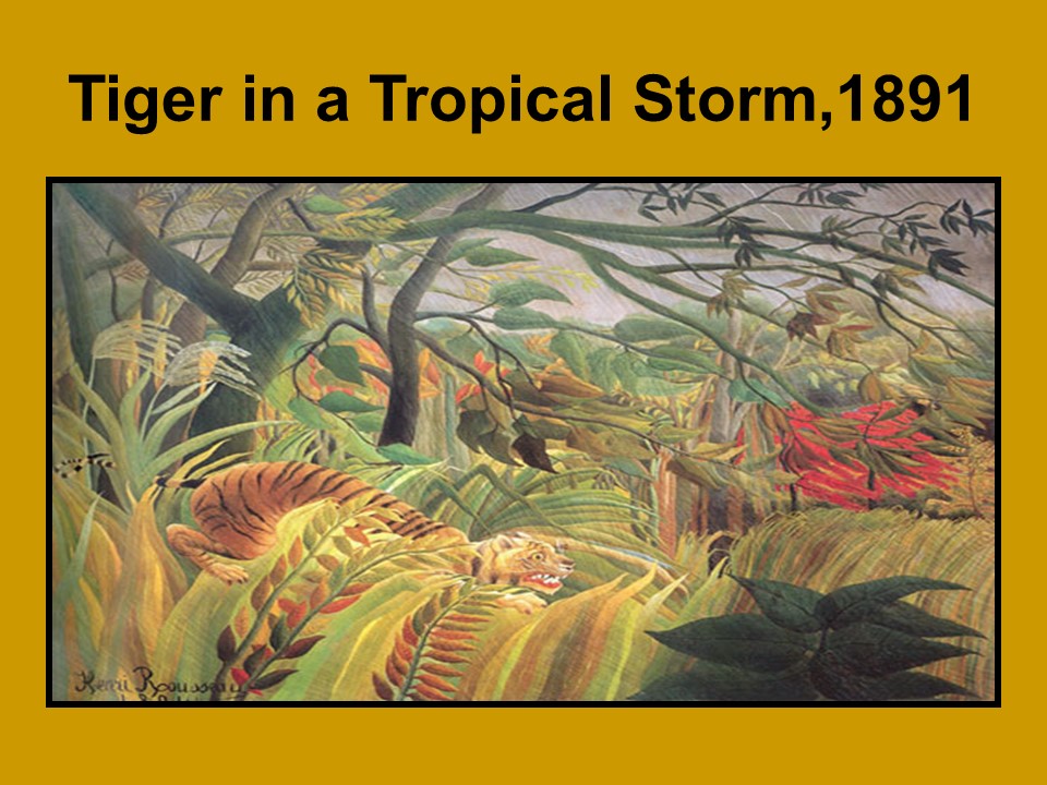
This was his first of many jungle scenes. Henri never went to a jungle he used his imagination. He did go to the local zoo for inspiration!


The beauty of nature was very important to Rousseau, and towards the end of his life he began to paint strange, exotic- almost surrealistic scenes featuring  wild animals and jungle themes. The innovative style of the jungle pictures brought a break-through for Rousseau; The Snake Charmer was commissioned by the influential Berthe Comtesse de Delaunay, mother of the painter Robert Dleaunay, and resulted in the attention and acceptance in exclusive Parisian circles that Rousseau craved. 

Typical of Rousseau's work, the painting is based on the strict reality of detail, and is built almost collage style. The botanical leaf provides the basic structure, with endless possibilities of repetition, variations, seriation and multiplication and including dozens of shades of green. The leaf guarantees the strict two-dimensionality which other more abstract artists could achieve only at the expense of meaning. Many minute details prevent the eye from resting on any central focus, and each part of the picture is given equal status, with no part subordinated to any other. Disproportionate forms, abrupt changes of color, and backdrops brought into the foreground all contribute to the complexity of the overall effect. 


Many of Rousseau's jungle pictures show some predilection for violence, perhaps indicating some hidden turbulence in the artist's character. The story is that Rousseau was so much in the grip of his imagination while painting these pictures that he felt stifled and afraid and head to open the window. 


Here we see bright colors and not a lot of detail. What do you see in this painting? 

Monday, March 6, 2017

M.C. Escher


First picture is a Self portrait done in lithographic crayon. The Dutch artist Maurits Cornelis Escher was was born in Leeuwarden, in the northern part of Holland, in 1898. Initially, he studied to be an architect, but he became increasingly interested in graphic art and eventually turned to being an artist. 

The second picture is a lithograph. We can see much from the reflection in the globe. The artist has drawn himself as well as the room in which he is sitting. 


Castrovalva another lithograph. His first works were very detailed realistic representations. Notice all the detail you can find in this work. As your eye travels over the landscape you will notice three villages and the roads connecting them. Look at the clouds that are coming over the mountainside. Can you tell which way the wind is blowing? 


The palm tree is a wood engraving-which is a print made from the carving on the end grain of a piece of wood. This particular piece is made from two blocks which make more color possible. Notice that while this work is done in black and white, there is also gray. 


Sky and Water I, woodcut. In 1935, when the artist was 37 years old he changed direction with his work. Up until then he had been mostly interested in improving his technique in representing realistic objects. Now, inspired by Moorish mosaics which he had seen in Spain when visiting the great Moorish mosques there, he began experimenting with techniques of tessellation and transformation. In a tessellation continuous and interlocking shapes cover the surface without overlapping or leaving gaps Transformation means that the shapes change from one image to another. Look at the top and bottom of this print. At the top there is a realistic bird, at the bottom an equally realistic fish. As your eye moves from the bird to the fish notice what happens to the space between the birds. It becomes the fish!


Continuing this theme, the artist explores the fish and birds again with this tessellation. This print is a woodcut which is different from a wood engraving in that it uses the front of a block, not the end. Sometimes you can notice the wood grain in a woodcut. 


Day and Night, woodcut from two blocks, Here we have a print which has incorporated both a landscape and a tessellation/transformation. At the bottom of the picture you can see two towns with a patchwork of a farmer's fields between them. The fields would be a tessellation, continuous and interlocking shapes covering the surface. As your eye moves upward you see the transformation, the fields become birds. Notice that there are both white and black birds. Which did you see first? Now notice that one of the towns is in darkness and the other is in light. The title of the print is Day and Night. Can you see how the black birds are flying through the daytime sky of one town, while the white birds are flying through the night sky of the other town? 


Puddle is a woodcut print. Here is another type of print that Escher experimented with. He called these next 3 images part of his experimentation with mirror images. Let's look carefully at this woodblock. We can be detectives as we find the tracks of two cars, two bicycles and two people walking. What time of day is it? Where is this mud puddle? 


Three Worlds is a lithograph. The artist called this print "Three Worlds" What levels can you see as you look into the pond? Do you see the fish swimming in the water? The leaves which float on top of the water? The trees reflected in the water?


First portrait is a lithograph. Here we have a drawing which represents many different points of view. Look at the top middle of the print. There are two people walking on a stairway. Notice that one of them is walking up the stairs and the other is walking down. That wouldn't be so strange, but they are walking in the same direction!

Second portrait is also a lithograph. By now your poor eyes must be thoroughly tricked! Here we see a lithograph of a structure with a waterfall. In fact, the artist has called it "Waterfall". Look at the background. It is a series of terraces. Notice how the terraces step down one after the other. Now look at the waterfall and follow the water with your eyes as it plunges over the fall and turns the water wheel. Then follow it as it flows downstream. It must be flowing downstream since water always flows downstream and besides look at the wall alongside the water. Don't the bricks step down every few bricks? The only problem is that if we continue to follow the water downstream we end up upstream ready to go over the waterfall again. What happened?!?


Drawing hands, lithograph. Here we have a piece of paper which is tacked to a surface. There is a hand which seems to be drawing a cuff of a sleeve. The cuff looks like a drawing. It sits flat on the paper. But out of that cuff comes a hand which seems to emerge right off the paper to grab a pen and draw another cuff connected to the first hand! What techniques have the artist used to make the hands look so three dimensional (rounded) while the cuffs look two dimensional (flat)? 


The rest of the pictures are examples of symmetry work. Look at each on and see the images that are in them. What do you think? 


Tuesday, December 13, 2016

Claude Monet
1840-1926


This photo was taken only 3 months before Claude Monet passes away. Although his sight was limited because of cataracts he still painted until he died in 1926.


As a young man of fourteen and fifteen, Monet would wonder around the beaches of his native LeHarve, making caricatures of tourists. He earned money about 10-20 francs for each caricature. 


Monet loved to paint the effect of light on a subject rather than the subject itself. Here we see early morning light on water. Water was one of Monet's favorite subjects. This painting gave impressionism its name. A journalist actually made fun of the painting, because it was not a complete painting it was only an "impression".  Despite this insult, Monet and his friends continued to exhibit their paintings. It would be ten years of ridicule and meager sales before impressionism became popular. 

Notice how the paint is applied in dots and dashes-an impressionists hallmark. 


Another Monet's favorite subjects; flowers, especially poppies. The boy in the foreground is his son, Jean. This painting is composed of colors, rather than forms. The lightness of the two puffy clouds is balanced by the pair of dark trees. The stretch of yellow sunshine against the grey line of the distant hills weights the right half of the picture (remember Leonardo how he painted the blue landscape in the distance also?). And Jean, surrounded by the bright flashes of red poppies brings the viewer's eye full circle. 

Monet did not make his pictures like Leonardo, sketching out each section and practicing form and placement. He quickly filled the entire canvas with tones, dabbing color everywhere and filling in the details as he went.  


Rather than paint staged pictures of historical or biblical subjects, the impressionist painted the every day world around them. Newly popular steam trains and the great glass architecture of the stations fascinated Monet, especially the effect of light on the steam. Monet painted this station  and its trains every day for 3 months, his first "series". You can still take the train to Givenry from this station. 

What draws your eye upwards? -peak of roof, steam. What balances it on the bottom?-dark color, solid form, tint vs. shade. What forms are repeated here?-circles, rectangles, organic and geometric forms. What keeps your eyes from wandering outside the station?- big puff of smoke. Where have we seen these clouds before?- previous painting also Leonardo's work.  


In the Haystack series, Monet sought to show the changes of light and atmosphere in each one. What time of day do you think this is?- Sunset. What kind of weather? Describe what is different about this painting compared with the train painting. Subject, choice of color, choppier brushstrokes, no atmosphere. 


Light radiates softly behind the hay, lighting the hills, trees, houses and fields. The peak of the haystack looks as if it is melting. 


Monet paid the farmer to leave the haystacks in the fields all winter so he could paint them. Notice how Monet balances the smaller haystack with the same amount and shape of negative space. Are there more tints of shades in this painting?-tints. Are there more warm or cool colors? - cool. Is this what you would expect? 


Monet moved to his country home in Giverny, 40 miles from Paris, in 1883. He virtually abandoned scenes of everyday life, to paint his garden and pond or "water landscape". He painted extensive gardens and created a pond with a Japanese footbridge as Japanese art was becoming popular in the late 1800's. This house, pond and garden survives virtually intact today. 
You can see the effect of photography (without which impressionism would never have begun) in this work. There are shadows on the path from trees we cannot see, outside the plane. 


Here we see the footbridge over the waterlily pond. 


This painting is probably a detail for Monet's last waterlily series which hangs in the Orangerie Museum in Paris. Monet had a large studio, and as he loses his sight, his canvas grows bigger. His brushstrokes are looser and freer, almost abstract. 


Notice the composition of this work. No horizon line, no background, little detail. What gives this painting balance? -equal tones, triangles. 


Contrast this painting with the last two. What is the difference? The same? How can you tell Monet did not paint this at the beginning of his career?