Pages

Monday, December 8, 2014

  • CALENDAR AT BOTTOM OF POST
  •  
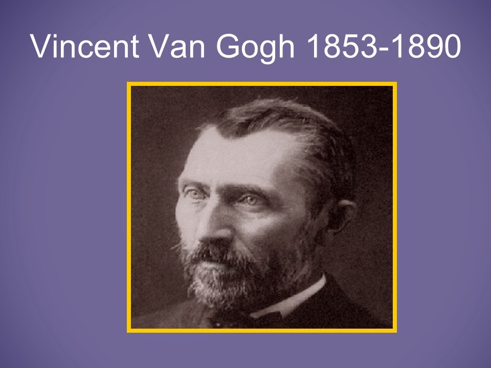
Vincent Van Gogh
 
At l6 Van Gogh started selling art in England.
Van Gogh decided to be a missionary in Belgium when he was in his 20's.
The poverty he saw made him so sad, that he started painting what he saw.


The Potato Eaters, 1885

How does this painting make you feel?
He painted in dark colors to portray the sadness.
This was before Van Gogh had any formal training.
At this point, Van Gogh didn't realize the importance of color.
 
Boots with Laces. 1886
 
Van Gogh started painting traditional Dutch subjects.
They are landscapes, portraits and still life, like the shoes.
 

Self-Portrait with Pipe. 1886

Van Gogh concentrated on the subject's eyes and expression when doing portraits.
Around this time, Van Gogh moved to Paris, France to live with his brother.
Van Gogh met impressionist painters.
Notice the difference between the first painting and the one to the right of it.

Self-Portrait in Straw Hat, 1887

How is this portrait different from the one on the left? (brighter colors, freer strokes,
happier feeling)


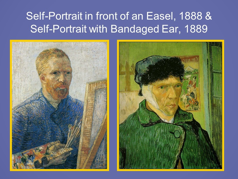
Self-Portrait in front of an Easel. 1888

Van Gogh moved to the south of France where the weather was nice and continued
painting impressionist style.

Self-Portrait with Bandased Ear. 1889

Van Gogh suffered mental illness (depression) for many years.
This painting was done after Van Gogh cut his ear lobe off to send to a girl he liked.
He painted the picture to use as a photo to send to his brother, Theo, showing that he was
okay.
 

Gauguin's Chair. 1888

Gauguin was an artist friend who lived with Van Gogh for a while.
He painted this as a tribute to his friend.

Vincent's Chair with Pipe. 1888

Van Gogh liked to paint in yellows and blues mostly after meeting the impressionist
artists.  

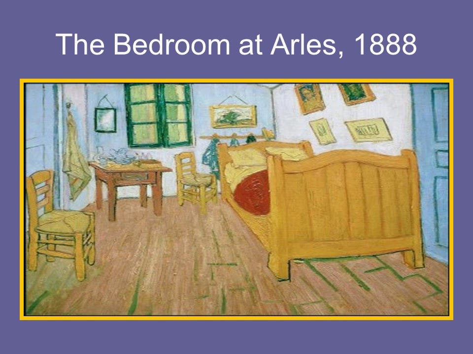
The Bedroom at Arles. 1888

Van Gogh would paint pictures to show where he lived.
He used paintings like we would use photographs today.


Vase with 12 Sunflowers. 1888

Van Gogh did several still life paintings of sunflowers.
He used thick brushstrokes (impasto) and heavy layers of paint.

Sunflowers in a Vase, 1888

Van Gogh created some of the sunflower paintings with the intent of decorating the
bedroom walls in Arles where his friend Gaughin was to stay.


Café Terrace/Sidewalk Café at Night. 1888

Vincent thought night was more richly colored than day, so he liked to paint night scenes.


Road with Cypresses, 1889

Van Gogh's studies of Cypresses lead to his painting of Starry Night.
Characterized by swirls and movement
He combined impressionism with feeling creating Expressionism.
This is created at a time when Van Gogh was depressed and feeling sad.
Starry Night. 1889

This is one of Van Gogh's most famous and emotionally powerful paintings.
Sometimes when Van Gogh painted, he would just squirt the paint right on the canvas
instead of using a palette - a very thick application.
Van Gogh was fascinated with astronomy and the sky. He liked to paint haloed stars,
moons and suns.
 

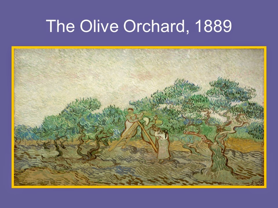
The Olive Orchard. 1889
 
This is considered by Vincent to be muted colors. (less bright and more conservative)


Crows Over the Wheat Field. 1890

Van Gogh painted from the landscape he saw of Arles.
This is one of his last paintings.
Can you sense the wildness and turmoil he felt by looking at some of his paintings?
He wrote to his brother Theo when the weather in Arles had worsened how there were
"vast fields of wheat under troubled skies", adding that he did not "need to go out of my
way to try and express sadness and extreme loneliness".
Van Gogh died in 1890 when he was 37 years old.
He sold only one painting during his poor and difficult life.


Friday, October 3, 2014

Maurice Sendak, Illustrator 1928-2012

 
MAURICE SENDAK
Illustrator 1928 - 2012
 Calendar at bottom of Post
 
 
 Photographs of Maurice
 
Sendak was born in 1928 in Brooklyn, New York, Sendak is an American writer and illustrator of children's literature. He is best known for his book Where the Wild Things Are, published in 1963 and recipient of the Caldecott Medal. Sendak was a frail and sickly child so he spent much of his young life indoors; he developed a love for books. It was during this period that he began to draw and allow his imagination to run free. He was age 12 when he decided to become an illustrator after viewing Walt Disney's film "Fantasia".  Above, the 1984 photograph on the right shows Sendak at work.

 
Self-Portrait for TV Guide, 1978.
 
 Walt Disney's Mickey Mouse was a dominant figure during Sendak's childhood. He looked on the mouse hero as "an early best friend" and recalls his earliest color drawing of the mouse when he was only six years old.
 
 
  Toes are to dance on and A book is to look at. pen and ink from "A Hole is to Dig" by Ruth Krauss. 1952
 
 This pen and ink drawing was one of several he did to illustrate a book called "A Hole is to Dig" It was his first major assignment as an illustrator. The book has no plot, but is a collection of genuine children's definitions. Some of them are: "Dogs are to kiss people", "Hands are to wash", and "A hole is to dig". Sendak collaborated closely with the author on his illustrations. She agreed to share the books royalties with the young artist. He is an artist who varies his style from project to project. Here, the simple clear line drawings add a fresh and easy charm to the simplicity of the text. Do you enjoy reading and looking at books? Where is your favorite place to read?

 
"The Sign on Rosie's Door''. 1958
 
This is his third book and finds a more self-assured artist where in the story he casts Rosie in a slice of Brooklyn life drama. Rosie carries her less imaginative cronies aloft on flights of fancy. Thanks to Rosie, they are able to defeat the boredom of a long summer day by attending a command performance by "Alinda the lovely Lady Singer". He looks fondly on this work as a major advance in his lifelong exploration of the ways in which children turn to fantasy as a means of escaping their daily troubles - in this case, endless stretches of vacation time with "nothing to do".

 
 The Riverbank. watercolor. from "Mr. Rabbit and the Lovely Present" by Charlotte Zolotow,1962

This is one of the most popular works of Sendak's early years. The story is about a little girl who is looking for a present for her mother and accepts help from a rabbit she meets. The illustrations for this book were all done in soft luminous watercolors.
Sendak had seen an exhibition of watercolors by Winslow Homer in Massachusetts which inspired him to try the same style and technique here. As Homer worked in New England, he also chose a setting in Vermont to paint his illustrations.

 
  "Where the Wild Things Are". pen and ink with watercolor by Sendak. 1963
 
 This is his most popular children's book. We are looking at the cover page from the book. The illustrations were done in pen and ink and colored in with watercolor. The story is about a boy. Max, who dresses up in a wolf suit and makes "mischief of one kind or another." When he misbehaves, he is sent to bed without supper and then travels to the world of the Wild Things where he becomes king. The text is very simple, a loose free verse, but the monsters whom Max meets are a wonderfully complex mixture of frightening and funny. Some of you may have seen the movie based on these characters.

 
MAX

Max from "Where the Wild Things Are"~ Notice all of the pen and ink lines. Does Max look happy to you? Max is banished to his room with nothing to eat. Have you ever been sent to your room?
 
 
Wild Rumpus

  Wild Rumpus from "Where the Wild Things Are"~ Here, Max has tamed the Wild Things by staring into their yellow eyes. They have made him king and are having what Max calls a "wild rumpus". Once again we can see Sendak's wonderful technique of crosshatching his characters and his colorful watercolor backgrounds. When this book was first published, there was some concern among adults that the monsters would be too scary for young children. Children, however, clearly love the book. Awarded the Caldecott Medal for the most distinguished picture book of the year in 1963, it consistently sold over 30,000 copies since its publication.

 
  "In the Night Kitchen", pen and ink with watercolor. 1970
 
To the left we see the cover of the book, and to the right we see one of the detailed pages showing the bakers. Can you see what the bakers are doing? Does something seem peculiar to you? Here the bakers absentmindedly mix Mickey into their batter. When Sendak was young, there was a bread advertisement for the Sunshine bakers, and it read "We Bake While you Sleep!" He used to save coupons showing three fat little bakers going off to their magic place while he went off to bed. This book was sort of a vendetta, he confessed, "to get back at them and to let them know that I was now 'old enough to stay up at night and know what was happening in the Night Kitchen."
Notice on the cover the various shapes of the bottles. Do they appear to represent something - perhaps a city of buildings? In this book he made good use of some verses he had chosen for an abandoned Mother Goose project. His hero. Mickey, announces "I'm in the milk and the milks in me" is a variation of the rhyme "I see the moon. and the moon sees me."

 
 Mickey from "In the Night Kitchen". pen and ink with watercolor, 1970
 
 A small boy,Mickey, is awakened by a racket in the night and falls through the dark, out of his pajamas. He falls past his sleeping parent's bedroom, and into a bowl of dough.  In to the night kitchen, as we noticed from the previous slide.


We will be doing Scratch art "monsters"
 
Schedule Sendak Presentations with your teachers for October or November.


Sendak Scratch Art Monsters


For Kinder through 2nd grade:

1.  Practice texture techniques with pencil on the handout.

2.  Choose a couple of texture techniques to practice on the small scratch art square piece with scratch tool.

3.  Choose a scratch art paper with a monster already outlined. (2 designs to choose from)  Have them immediately put their names on the back!!!

4.  Start scratching away the black layer along the outlines and fill in desired details around the face, adding textures. (You can show them the outlines with the facial details etc. on the larger paper example found in the notes folder for reference.)


For 3rd through 5th grade:

1.  Practice texture techniques with pencil on the handout.

2.  On a blank piece of paper draw a monster.  (Use the colored half sheets)  Once you are finished with your outline and simple details, make sure that it is outlined with heavy dark pencil.  (May need to have them trace over it again to make it darker.)

3.  Put name on the back of the scratch art piece!!!  Turn your monster sketch over on top of the black side of the scratch art paper and tape it in place or hold it carefully.  Rub with the side of your pencil lead and cover the paper.  (You will see a light impression of your drawing coming out, and this will be rubbing your drawing onto the scratch art paper.  Please note that the image will be reversed- mention this to the kids ahead of time.) Remove the colored paper.

4.  Choose a couple of texture techniques to practice on the small scratch art square piece with scratch tool before tackling the big project.

5.  Begin working on your monster piece- start scratching away the black layer along the outlines of your drawing, and fill in texture areas.  


***Please note: if a student is struggling, you may want to provide a pre-outlined monster stencil to use and roughly follow steps for kinder through 2nd grade with them.  These are in the folders on the cart.  (You can show them the outlines with the facial details etc. on the larger paper example found in the notes folder for reference.)

*Items on the cart:  Notes, scratch tools, glue, and Sendak books. (Cart is by the sink in the art lit space in the library.)

*Items to pick up from the shelf (Bottom right shelf in the art lit space of the library):  1 Scratch art piece for each student (Take both designs), 1 small practice square scratch art piece for each student, 1 texture handout for each student, labels for each student, and 1 white construction paper backing for each student. 

Don’t spend too much time on the prep parts, encourage them to move along…they will need extra time for the work on the actual scratch art part.
EACH STUDENT GETS ONLY ONE PIECE OF SCRATCH ART PAPER!!!!  
For 3rd through 5th grade (continued):

Art Lit Presenter: Please back the pieces on the white paper.  (Label and write first names on them.  See example picture below.)  Return them to the art lit space and file them on the desk with a file folder.  Reassure the students that they will get them back, we just need to store them for a bit in case we decide to do an art show to display their work.


Have fun!! Looking forward to seeing some finished art work!!


Thursday, April 17, 2014

 
Pierre-Auguste Renoir, Impressionist (1844-1919) 
 
 Here is the next artist and the slide show. This will be a great project! Have fun with the kids, creating art!
 
 
·         Impressionism – A style of art developed in France during the late 19th century that focuses on unmixed primary colors, small brush strokes, and use of light to convey visual reality.   Impressionist paintings often give a sense or feeling of the subject… They may not look exactly real, but you can tell what it’s supposed to be.

·         Contrast – In art, contrast refers to opposite.  The difference in color and light between parts of an image.  Examples: Light/shadow, or opposite colors.

·         Complementary Colors – Colors that are across from each other on the color wheel.  These colors are opposites and they contrast.  (Yellow/Purple, Orange/Blue, Red/Green)

 
Pierre-Auguste Renoir, Impressionist (1844-1919)

Pierre-Auguste Renoir (p’YAIR, o-GOOST, run-WAR) was born in Paris, France in 1844.  His father was a tailor who used chalk to mark the clothes he sewed. Renoir would find the bits of chalk his father left around and would draw on the walls and floors of his home.  Renoir’s father would get upset when his marking chalk disappeared, but he had to admit that his son’s drawings were pretty good!

 At the age of 13, Renoir began painting floral designs on china.  He later studied at an art studio with other young artists including Claude Monet.  He and these other young artists developed a style of art called Impressionism. 

Impressionists paint small dabs of primary colors right next to each other.  Instead of the artist mixing the colors together, our eyes blend them.  The artists paint quickly, without much detail.

 
Spring Bouquet, 1866

This was an early painting by Renoir, done when he was 24.  The Impressionist technique had not yet evolved when he painted this picture.  The flower petals and leaves are separate and distinct.  However, this painting glows with light indicating Impressionism was just around the corner.    Impressionists often painted outdoors, so they could show the magic effect of light upon color.

Which side of the painting is the light coming from?  Do you see a shadow?

The light appears to be coming from the left side of the canvas because there are shadows on the right side.  Also notice the bits of dark colors alongside the bright whites… these colors show contrast.  

 
La Grenouillere (The Frog Pond), 1869

In the summer of 1869, Renoir and his good friend Claude Monet set up their easels together at a popular resort near Paris, and began to paint, each in his own style and each with a slightly different view.  These paintings are considered some of the very first Impressionist paintings, and Renoir’s friend would also become a very well-known artist.  The larger painting is by Renoir, the smaller is by Monet.

The name of each painting, La Grenouillere (la gren-OO-lair), means “frog pond” although strangely enough, the body of water next to the restaurant did not have any frogs!

Although the two pieces look slightly different, they have some things in common.  Each presents a casual moment of daily life – The people are not posing.  We can see the brushstrokes, the use of varied and contrasting colors, and the use of light.  We can see the areas where the light is hitting, and how it creates shadows and reflections.   Notice how dark each picture is in the foreground and how light the trees are in the background.

Can you see the reflections of the people in the water?  How about the tree?  Can you see contrast in the ripples of the water?


Moulin De La Galette, 1876

This large painting is Renoir’s most famous masterpiece (moo-LON day la GOL-ett).  He worked on it for 1 ½ years.  This was a dance hall near Paris where young people went on Sunday afternoons to chat and dance.  Renoir loved to paint his friends, and all the people in this work were his friends, models, writers, or fellow Impressionist artists.

Here the whole scene is made up of contrasting colors…sunlight and shade artfully blurred into the figures themselves.  There is no boundary and we seem to be within the picture itself and part of the action. 

What color do you see most?
It appears to be black, however there is no black at all in this painting.  The dark shadows, coats and hats are shades of blue which in fact look black because they contrast with the natural light.


Luncheon of the Boating Party, 1879

Renoir was always viewed as a fun, friendly, and easy going person with good will.  He liked being with people and enjoyed the things around him.  He is best known for his pleasant paintings of everyday situations and happy surroundings…young girls, children, flowers, and joyful, informal gatherings.  In the previous painting, he used a lot of darker colors, but he was known for his use of bright, warm, happy colors.

The figures in this painting are larger and fewer than in the previous painting.  There is a great feeling of animation… the movement of hands and faces and in the fluttering of the awning.

Do the people in this picture look like they are friends?    

Yes, they look like they are talking and having a good time.  Renoir’s future wife, Aline, is the lady on the left with the dog.  They married in 1890, had 3 sons, and were married for 25 years.  The man facing her sitting backwards on this chair was a painter friend of Renoir’s.

Did Renoir carefully pose all these people to paint their portrait? 

No. He painted them as they were talking and eating and enjoying themselves.  But, he did plan a path for our eyes to follow.   We start with this man’s arm on the left leaning against the railing.  We continue to the woman’s arm across the table to the arms of the two men. We notice all the interesting faces across the top of the picture.  We follow the woman’s arm on the railing.  And that brings us back to the first man.  Renoir planned the path so that you would notice everything in the painting.


Oarsmen at Chateau, 1879

Boating and water related activities were very popular French hobbies.  This type of subject matter was well-suited for the Impressionists because they could show the sparkling and contrasting effects of light on water.  We also see the use of complemetary colors to show contrast in this painting.

What examples of contrast can you see in this painting?

Some examples: The orange boat and blue water contrast. (complementary colors)  The dark blue and white areas on the water contrast. (light/shadow).  The white ruffle on the woman’s skirt and the shadows on her skirt contrast, as does the man’s white jacket and his dark pants. (dark/light)

Do you think this painting looks like spontaneous (not-planned) moment captured on canvas?

Yes, it’s as if someone had a camera and took the picture before they all got on the boat.  Impressionists were famous for this style of painting.

 
The Doge’s Palace, Venice, 1881

 Renoir was known for painting figures or people…  even most of his landscapes have a emphasis on the human element.  However, during his travels, Renoir did several pure landscape paintings.  While in Venice, Italy, he did this wonderful painting of the palace. 

Can you see any people in this painting?

Yes… look at the boats.  But the figures in the boats have been reduced to dark contrasting dabs of paint blending in with the sparkling water. 

Look closely at the water.  How many colors do you see?

We can see almost every color, and we can clearly see that he used dabs of paint, but the impression it gives is “water”.

 
The Swing, 1876 and Girl with a Hoop, 1885

 Here are 2 more happy paintings.

In The Swing, notice how Renoir has created a joyful feeling by using bright colors.  

What are the white spots on the painting?

It’s the light shining down through the trees.  The sun filters through the trees above and creates dark and light areas on the people and ground.  Colors change when the sun shines on them… Dark blue becomes light blue or even white!

What parts of this painting show contrasting color?

The woman’s light dress with the dark bows and the man’s dark suit.  The light filtering onto the walkway and the shadows of the trees on the ground.  The little girl’s dress and the dark tree.

In the Girl with a Hoop, notice the there appears to be edges to the figure and objects.  During this time he was trying to find a tighter drawing style but still use the Impressionist ideas of light and color.  The colors are bright, but subdued…there is not much contrast…only her dark shoes and dark hair. 

At the height of Renoir’s career, his health unfortunately failed him and he developed painful arthritis.  Little by little the joints of his arms and legs stiffened and he was eventually confined to a wheelchair.  He never stopped painting though…with brushes strapped to his wrists, he continued to paint every day until his death in 1919 at the age of 78.  

 
Are you ready to create like an Impressionist?

Renoir loved to paint flowers.  Notice these paintings… The flowers don’t look realistic, but we still know they are flowers.  They look like they were done quickly, and they don’t show tiny details.  There are many areas of contrast… like the green against red in the first painting, or the white against the dark blue in the second painting.

Today, we will use chalk to “paint” an Impressionist vase of flowers, and then use sugar water to create our “brushstrokes”. 

And remember, just like the Impressionists, our paintings should be “vase-ish” and “flower-ish”!


Project Recap:

Students will create chalk and sugar water floral paintings.

Project Materials:

  • White watercolor paper
  • Pencils
  • Drawing chalk
  • Sugar water (1 Tablespoon sugar to 1 Tablespoon water) and small containers (1 per student)
  • Black mounting paper

Step 1:  Remind students to put their name and teacher’s name on the back of their paper.


Step 2:  Make an outline of a vase and/or flowers with pencil

·         Younger grades can choose to just create a single, large flower and stem (no vase). 

·         Remind the students that vases and flowers are “vase-ish and/or flower-ish”, especially since we are emulating an Impressionist style.  We will have some simple flower examples up on the wall in the portable, but small details will be lost in the following steps.

·         The vase and/or flowers should take up most of the page.

Step 3:  Color the picture with chalk

·         Lighter colors should be used first.

·         Encourage the use of complementary color combinations (Blue/Orange, Red/Green, Yellow/Purple) or contrasting light and dark colors.

·         Backgrounds may also be colored.

Step 4:  Distribute water, and use fingers to lightly dab water onto the painting

  • Tell students to rinse/re-dip fingers between colors, and dab lightly (rubbing will smear colors).
  • It’s easiest to do one color at a time (ie, do all yellow areas, then blue etc).
  • Water should be used sparingly – they should not create puddles on their paper.
  • The sugar water will seal and brighten the chalk, and create an “Impressionist” dab-like effect.
  • If flowers are hard to see, they may choose to re-outline with colors or black.


Mounting:  A stack of black mounting paper will be provided in the Art Lit Portable.  Please only take what you need for your class.  Glue the finished drawings onto the black background, and adhere printed labels at the bottom, on the black paper.